
本页目录
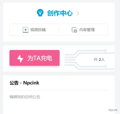
将哔哩哔哩的充电移植到 B2 主题的赞赏中。
效果
 响应式
响应式
- 1.1(修复了移动端显示错误)
- 代码版本:1.0(发布)
第一步,添加 HTML
找到主题根目录下的/Modules/Templates/Single.php 文件,将第 567 行内容
<div class="content-ds-button"><button @click="show()">'.__('赞赏','b2').'</button></div>替换为以下代码:
<div class="content-ds-button" @click="show()"> <div id="con"> <div id="TA-con"> <div id="text-con"> <div id="linght"></div> <div id="TA">为TA充电</div> </div> </div> <div id="tube-con"> <svg viewBox="0 0 1028 385" fill="none" xmlns="http://www.w3.org/2000/svg"> <path d="M1 77H234.226L307.006 24H790" stroke="#e5e9ef" stroke-width="20" /> <path d="M0 140H233.035L329.72 71H1028" stroke="#e5e9ef" stroke-width="20" /> <path d="M1 255H234.226L307.006 307H790" stroke="#e5e9ef" stroke-width="20" /> <path d="M0 305H233.035L329.72 375H1028" stroke="#e5e9ef" stroke-width="20" /> <rect y="186" width="236" height="24" fill="#e5e9ef" /> <ellipse cx="790" cy="25.5" rx="25" ry="25.5" fill="#e5e9ef" /> <circle r="14" transform="matrix(1 0 0 -1 790 25)" fill="white" /> <ellipse cx="790" cy="307.5" rx="25" ry="25.5" fill="#e5e9ef" /> <circle r="14" transform="matrix(1 0 0 -1 790 308)" fill="white" /> </svg> <div id="mask"> <svg viewBox="0 0 1028 385" fill="none" xmlns="http://www.w3.org/2000/svg"> <path d="M1 77H234.226L307.006 24H790" stroke="#f25d8e" stroke-width="20" /> <path d="M0 140H233.035L329.72 71H1028" stroke="#f25d8e" stroke-width="20" /> <path d="M1 255H234.226L307.006 307H790" stroke="#f25d8e" stroke-width="20" /> <path d="M0 305H233.035L329.72 375H1028" stroke="#f25d8e" stroke-width="20" /> <rect y="186" width="236" height="24" fill="#f25d8e" /> <ellipse cx="790" cy="25.5" rx="25" ry="25.5" fill="#f25d8e" /> <circle r="14" transform="matrix(1 0 0 -1 790 25)" fill="white" /> <ellipse cx="790" cy="307.5" rx="25" ry="25.5" fill="#f25d8e" /> <circle r="14" transform="matrix(1 0 0 -1 790 308)" fill="white" /> </svg> </div> <div id="orange-mask" > <svg viewBox="0 0 1028 385" fill="none" xmlns="http://www.w3.org/2000/svg"> <path d="M1 77H234.226L307.006 24H790" stroke="#ffd52b" stroke-width="20" /> <path d="M0 140H233.035L329.72 71H1028" stroke="#ffd52b" stroke-width="20" /> <path d="M1 255H234.226L307.006 307H790" stroke="#ffd52b" stroke-width="20" /> <path d="M0 305H233.035L329.72 375H1028" stroke="#ffd52b" stroke-width="20" /> <rect y="186" width="236" height="24" fill="#ffd52b" /> <ellipse cx="790" cy="25.5" rx="25" ry="25.5" fill="#ffd52b" /> <circle r="14" transform="matrix(1 0 0 -1 790 25)" fill="white" /> <ellipse cx="790" cy="307.5" rx="25" ry="25.5" fill="#ffd52b" /> <circle r="14" transform="matrix(1 0 0 -1 790 308)" fill="white" /> </svg> </div> <!--<p id="people">共 <b>361</b> 人</p>--> <span id="people" v-if="data.count">共<b v-text="data.count"></b>人'.__('','b2').'</span>
</div> </div> </div>第二步:添加 CSS 样式
在主题根目录下的 style.css 文件底部添加以下 CSS 代码
/*赞赏版本:1.1*//* 设置白色容器 */ #con { width: 350px; height: 85px; position: relative; border-radius: 4px; /*margin:50px auto;*/ } /* 设置文本内容容器 */ #TA-con { width: 157px; height: 50px; background-color: #f25d8e; box-shadow: 0 4px 4px rgba(255, 112, 159, .3); position: absolute; top: 50%; left: 5%; transform: translateY(-50%); border-radius: 4px; cursor: pointer; } /* 设置文本居中容器 */ #text-con { width: 100px; height: 100%; margin: 0 auto; position: relative; } /* 做一个小闪电 */ #linght { width: 0; height: 0; position: absolute; top: 36%; left: 4px; border-color: transparent; border-style: solid; border-width: 10px; border-top: 10px solid #fff; border-radius: 4px; transform: rotate(-55deg); } #linght::after { position: absolute; top: -13px; left: -11px; content: ""; width: 0; height: 0; border-color: transparent; border-style: solid; border-width: 10px; border-top: 10px solid #fff; transform: rotate(180deg); border-radius: 4px; } /* 文字 */ #TA { float: right; line-height: 50px; font-size: 15px; color: #fff; } #TA-con:hover { background-color: #ff6b9a; }
/* 创建图形容器 */ #tube-con { width: 157px; height: 55px; position: absolute; right: -5px; top: 15px; } /* 对svg图形设置宽高 */ .content-ds-button svg { width: 100%; height: 100%; } /* 创建一个蒙版 宽度为0,当我hover充电框的时候,宽度展开 */ #mask { width: 0px; height: 100%; overflow: hidden; position: absolute; top: 0; left: 0; transition:all 0.5s; } /* 对蒙版的sbg单独设置宽高,保证宽度高低有一个固定值而不是百分比 */ #mask svg { width: 157px; height: 55px; } /* 对充电框hover的时候开始动画,将粉色线条铺开 */ #TA-con:hover+#tube-con>#mask{ width:157px; } /* 对充电框hover的时候开始动画,添加黄色快速移动的动画 */ #TA-con:hover+#tube-con>#orange-mask{ animation: move1 0.5s linear 0.2s infinite; } #TA-con:hover+#tube-con>#orange-mask svg{ animation: movetwo 0.5s linear 0.2s infinite; } /* 创建黄色移动的蒙版 */ #orange-mask{ width: 18px; height: 100%; overflow: hidden; position:absolute; left:-15px; top:0px; } /* 创建黄色移动的内容 */ #orange-mask svg { position: absolute;; top:0; left:15px; width: 157px; height: 55px; } @keyframes move1 { 0%{ left:-15px; } 100%{ left:140px; } } @keyframes movetwo { 0%{ left:15px; } 100%{ left:-140px; } } #people{ position:absolute; right:10px; top:18px; font-size:12px; font-family:"雅黑"; color:#aaa; } #people>b{ color:#777; }
@media screen and (max-width: 768px) { .content-ds-button { top: 0px; margin-top: 2em;} #con { width: 10em; height: auto; margin: 0px; background: #fffcf7; }
#TA-con { width: 107px; height: 40px; left: 42%; }
#linght {top: 26%;} #TA {line-height: 40px;margin-right: 0.4em;} #tube-con {display: none;} }补充
替换默认的糖果图标,将下列代码的图片链接替换为自己的链接。
/*更改图标*/.b2-tang:before { content: ""; background: url(https://www.xxx.xxx/wp-content/themes/b2child-mqzj/images/dianchifang.svg) no-repeat; background-size: 19px 24px; width: 19px; height: 24px; position: absolute; margin: -26px 0px 0px -18px;}