
本页目录
94 设计素材网的模块标题简洁大气,表意明确,鲜明的颜色区分让一个个的按钮生动灵活。除了模块标题,我还顺手把 hover 动效写了下来,各位站长可根据自己的需要进行选择。
效果预览:
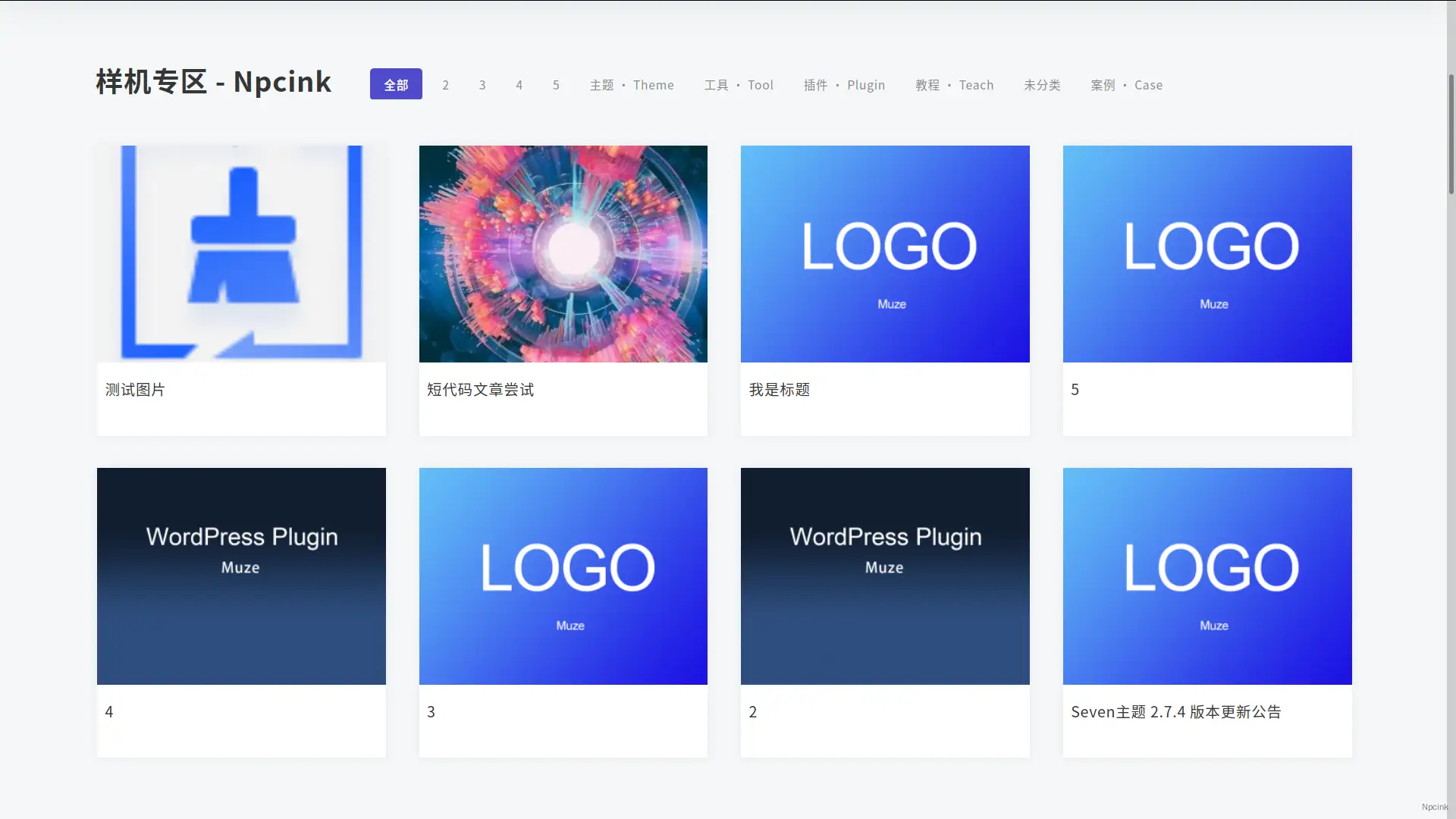
如何使用?
将以下代码添加至主题根目录下的 style.css 文件底部即可
/*仿94设计模块标题开始*/
/*标题*/.post-modules-top { padding: 0 15px 20px 15px; border-bottom: 0px solid #f3f3f3;white-space: nowrap;flex-direction: row;}
.post-modules-top .modules-title-box { padding: 8px 0; display: block;}
.post-list .module-title { position: relative; text-align: left; font-weight: 600 !important; font-size: 28px;}
.post-list-cats { padding: 10px 16px 10px 30px; border-left: none; border-radius: 6px; background: none; width: calc(100% + 2px); margin-left: -2px;overflow: hidden;}/*模块按钮*/.picked.post-load-button span { border-radius: 4px; background: #504BCC; color: #fff; padding: 10px 14px;}
.post-list-cats a span:hover { background: #504BCC; color: #fff !important; border-radius: 2px;}/*按钮背景颜色*/.post-list-cats a::before { background: #f6f7f8;}/*去除分割线条*/.b2_gap > li { border-bottom: none;border-right: none;}
/*加载更多按钮*/
.post-list .load-more button { padding: 11px 40px; width: auto; border: 1px solid #eee; background: linear-gradient(90deg,#504BCC,#7161ff); color: #fff; font-size: 14px; margin-top: 60px; border-radius: 5px;}
.post-list .load-more button:hover { background: #504BCC; color: #fff;}
/*hover动效*/.item-in { position: relative; /*margin: 0;*/ border: 1px solid #f0f0f0;box-shadow: 0 0 10px rgba(0,0,0,.05);transition: all .2s;}
.item-in:hover { -webkit-box-shadow: 0 3px 6px -4px rgba(0,0,0,.12), 0 6px 16px 0 rgba(0,0,0,.08), 0 9px 28px 8px rgba(0,0,0,.05); box-shadow: 0 3px 6px -4px rgba(62, 94, 255, 0.050980392156862744), 0 6px 16px 0 rgba(62, 94, 255, 0.050980392156862744), 0 9px 28px 8px rgba(62, 94, 255, 0.050980392156862744); transform: translateY(-3px);}
/*动效下标题调整*/.post-info { padding: 1pc 8px; background: #fff;}/*仿94设计模块标题结束*/相关风格的 WordPress 美化: