
本页目录
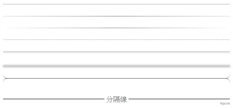
HTML 代码中, 我们常常使用<hr/>标签来生成水平分隔线 ,但默认的水平分割线不够特色,接下来,就分享一些有趣的水平分割线。
- 原文来源:详情
- 效果演示:页底
相关 CSS 代码
/* 渐变 color1 - color2 - color1 */
hr.style-one { border: 0; height: 1px; background: #333; background-image: linear-gradient(to right, #ccc, #333, #ccc);}
/* 透明渐变 - color - transparent */
hr.style-two { border: 0; height: 1px; background-image: linear-gradient(to right, rgba(0, 0, 0, 0), rgba(0, 0, 0, 0.75), rgba(0, 0, 0, 0));}
/* 双线 */
hr.style-three { border: 0; border-bottom: 1px dashed #ccc; background: #999;}
/* 单线阴影 */
hr.style-four { height: 12px; border: 0; box-shadow: inset 0 12px 12px -12px rgba(0, 0, 0, 0.5);}
/* 云朵状 */
hr.style-five { border: 0; height: 0; /* Firefox... */box-shadow: 0 0 10px 1px black;}hr.style-five:after { /* Not really supposed to work, but does */content: "\00a0"; /* Prevent margin collapse */}
/* 内嵌 */
hr.style-six { border: 0; height: 0; border-top: 1px solid rgba(0, 0, 0, 0.1); border-bottom: 1px solid rgba(255, 255, 255, 0.3);}
/* 晕状 */
hr.style-seven { height: 30px; border-style: solid; border-color: black; border-width: 1px 0 0 0; border-radius: 20px;}hr.style-seven:before { display: block; content: ""; height: 30px; margin-top: -31px; border-style: solid; border-color: black; border-width: 0 0 1px 0; border-radius: 20px;}
/* 文字插入式 */
hr.style-eight { padding: 0; border: none; border-top: medium double #333; color: #333; text-align: center;}hr.style-eight:after { content: "gb"; display: inline-block; position: relative; top: -0.7em; font-size: 1.5em; padding: 0 0.25em; background: white;}
/* 分隔线统一样式 */hr{ margin: 40px 0;}html 水平线中间添加文字
上文中的方法已经失效,参考这篇文章:
- 原文来源:详情
感觉这篇文章写的好复杂,可以参考本站的登录框是咋实现的,好像是用 CSS 顶上去,再给背景填充颜色。
<div class="personal-mybuluo-head"> <div class="personal-mybuluo-wording">她的部落</div> <div class="personal-border jmu-border-1px border-bottom"></div> </div>
<style type="text/css"> .personal-mybuluo-head { height: 14px; position: relative; } .personal-mybuluo-wording { position: absolute; top: 0; z-index: 2; left: 50%; background-color: #fff; color: #777; text-align: center; -webkit-transform: translate(-50%,0); transform: translate(-50%,0); padding: 0 10px; } .personal-border { position: absolute; top: -7px; left: 0; width: 100%; height: 14px; z-index: 1; } .jmu-border-1px { position: relative; } .jmu-border-1px.border-bottom:after { border-bottom: 1px solid #dedfe0; } @media only screen and (-webkit-min-device-pixel-ratio: 2) .jmu-border-1px:after { right: -100%; bottom: -100%; -webkit-transform: scale(0.5); } .jmu-border-1px:after { display: block; content: ''; position: absolute; top: 0; right: 0; bottom: 0; left: 0; -webkit-transform-origin: 0 0; -webkit-transform: scale(1); pointer-events: none; }
</style>